Angelo Outlaw

About

Experience
Work
Contact
Y Conference
Each year until 2025, AIGA San Diego held one of the most respected design conferences in the southwestern US. The theme and visual identity of the conference change each time, with a few guidepost elements in place for consistency. Mainly, 7-foot tall Ys in serif and sans-serif font. Let me tell you, they were not easy to move. For 25 years, speakers from all corners of the creative industry, and sometimes others, came together with 350 attendees and challenged us to ask...why!
See it Live

Challenge
The theme for each Y Conference started with a single word, and challenged the community to explore its essence. For Y21, the word was “distill”. As a design team, we needed to explore how a solution would fit together in both digital and environmental spaces.
Solution
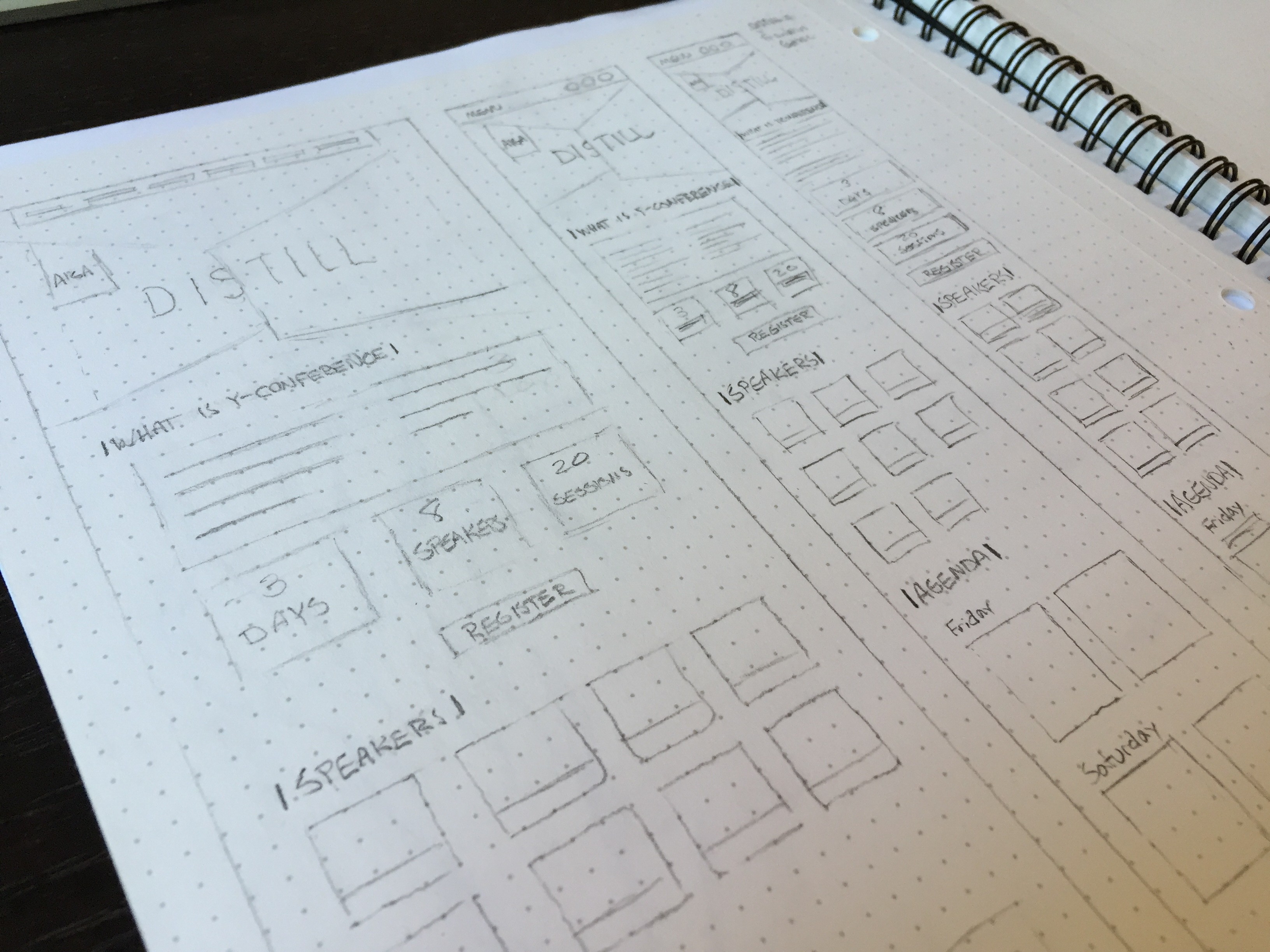
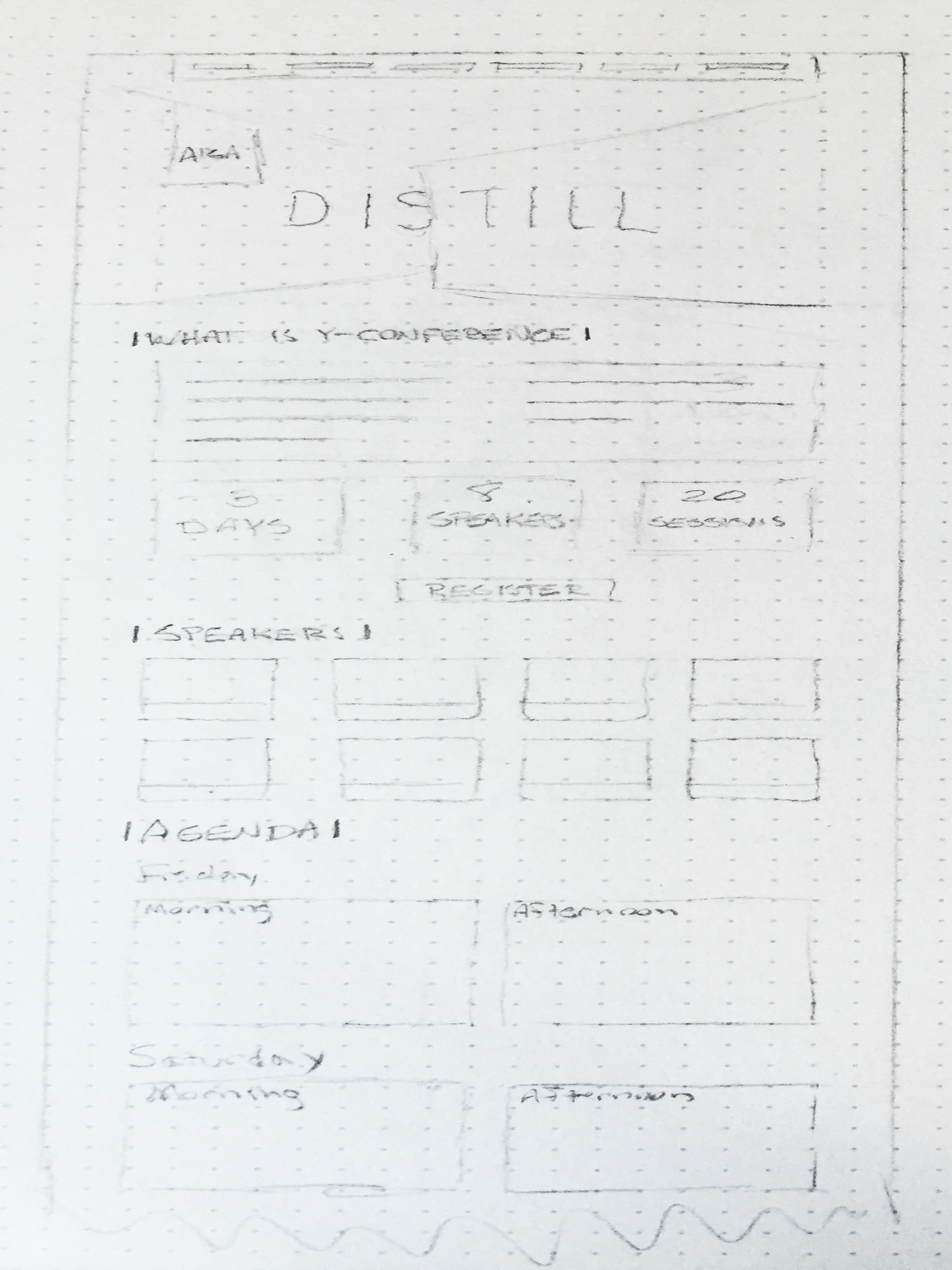
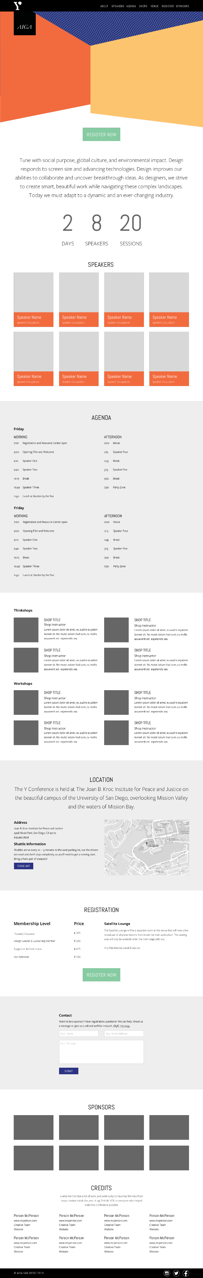
After numerous sessions, many post-its placed on walls, some passionate discussion, and many emotional support drinks, the team decided to apply the idea of distilling to the shapes that were used in the design. This meant distilling the shapes back to down to their most basic forms. I used the ideas we generated to create hand-drawn wireframes of each page type of the site, and moved into digital wireframes and mockups. After review and approval at each step, I moved forward with creating the website in Webflow.
Results
The site launched on time was well received by the audience, receiving the typical and fully expected array of reviews ranging from bewilderment to full advocacy. The site was available at desktop and mobile sizes. This was the first year that mobile usage eclipsed desktop usage according to analytics.
© Angelo Outlaw 2026
Angelo Outlaw
About

Experience
Work
Contact
Y Conference
Each year until 2025, AIGA San Diego held one of the most respected design conferences in the southwestern US. The theme and visual identity of the conference change each time, with a few guidepost elements in place for consistency. Mainly, 7-foot tall Ys in serif and sans-serif font. Let me tell you, they were not easy to move. For 25 years, speakers from all corners of the creative industry, and sometimes others, came together with 350 attendees and challenged us to ask...why!
See it Live
Challenge
The theme for each Y Conference started with a single word, and challenged the community to explore its essence. For Y21, the word was “distill”. As a design team, we needed to explore how a solution would fit together in both digital and environmental spaces.
Solution
After numerous sessions, many post-its placed on walls, some passionate discussion, and many emotional support drinks, the team decided to apply the idea of distilling to the shapes that were used in the design. This meant distilling the shapes back to down to their most basic forms. I used the ideas we generated to create hand-drawn wireframes of each page type of the site, and moved into digital wireframes and mockups. After review and approval at each step, I moved forward with creating the website in Webflow.
Results
The site launched on time was well received by the audience, receiving the typical and fully expected array of reviews ranging from bewilderment to full advocacy. The site was available at desktop and mobile sizes. This was the first year that mobile usage eclipsed desktop usage according to analytics.
© Angelo Outlaw 2026
Angelo Outlaw
About
Experience
Work
Contact
Y Conference
Each year until 2025, AIGA San Diego held one of the most respected design conferences in the southwestern US. The theme and visual identity of the conference change each time, with a few guidepost elements in place for consistency. Mainly, 7-foot tall Ys in serif and sans-serif font. Let me tell you, they were not easy to move. For 25 years, speakers from all corners of the creative industry, and sometimes others, came together with 350 attendees and challenged us to ask...why!
See it Live

Challenge
The theme for each Y Conference started with a single word, and challenged the community to explore its essence. For Y21, the word was “distill”. As a design team, we needed to explore how a solution would fit together in both digital and environmental spaces.
Solution
After numerous sessions, many post-its placed on walls, some passionate discussion, and many emotional support drinks, the team decided to apply the idea of distilling to the shapes that were used in the design. This meant distilling the shapes back to down to their most basic forms. I used the ideas we generated to create hand-drawn wireframes of each page type of the site, and moved into digital wireframes and mockups. After review and approval at each step, I moved forward with creating the website in Webflow.
Results
The site launched on time was well received by the audience, receiving the typical and fully expected array of reviews ranging from bewilderment to full advocacy. The site was available at desktop and mobile sizes. This was the first year that mobile usage eclipsed desktop usage according to analytics.
© Angelo Outlaw 2026