Angelo Outlaw

About

Experience
Work
Contact
Travel Cover
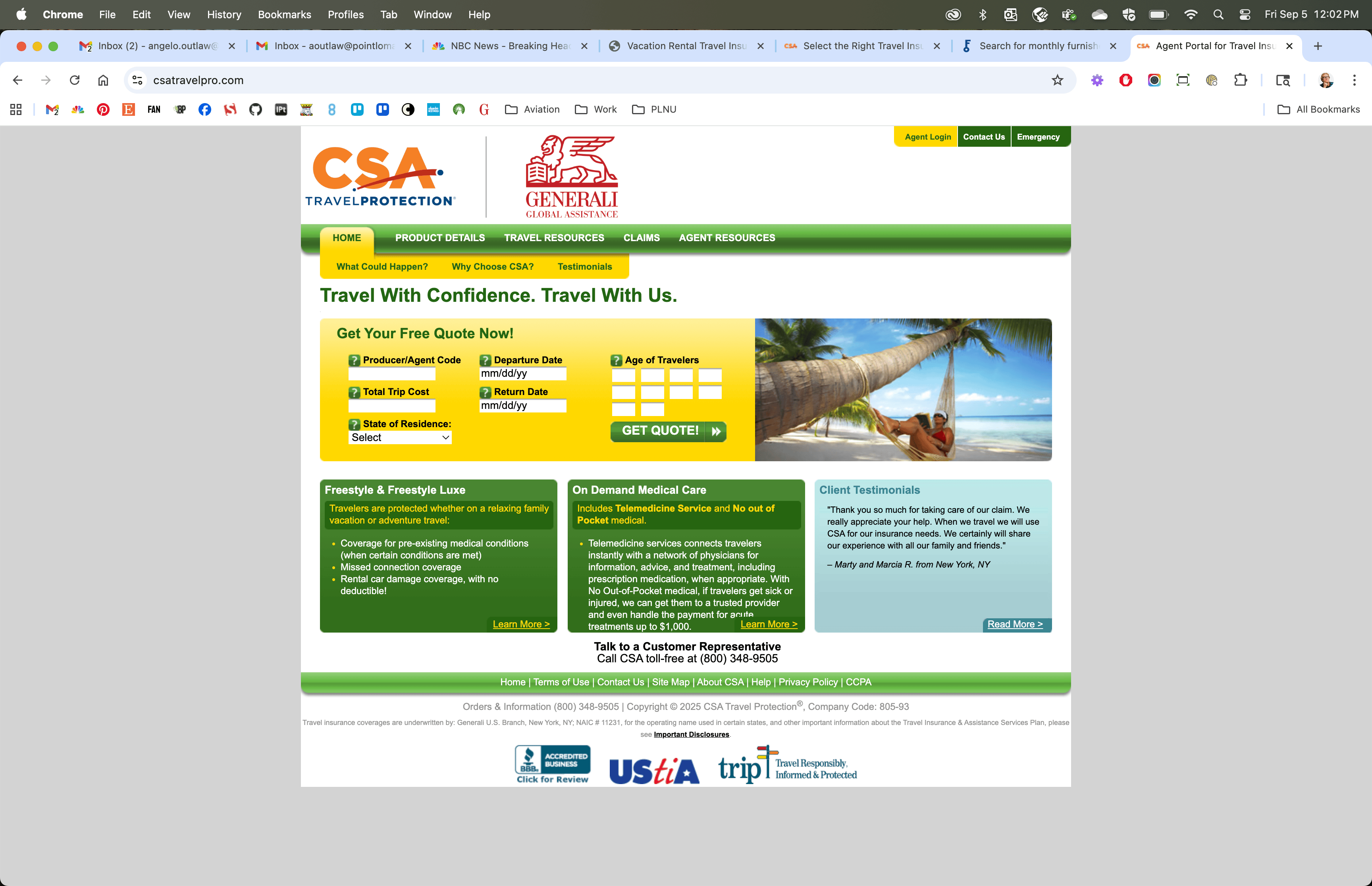
Our team’s task for this project was to replace a partner-facing legacy site that had been declining in effectiveness for years, and was becoming a liability. It was never brand-correct to begin with, and had become multi-branded with many of the features no longer working. Naturally, there was a lot of anticipation once the project finally had the support needed to move forward.
My role was to understand the challenge and ensure that the solution was successfully deployed, with oversight of the design, UX/UI, and partner experience as the site was developed.
Visual designs by Enia Amlashi
See it Live

Challenge
I needed to understand which features of the legacy site were actually useful to our partners, and then find ways to build them in a way that would satisfy our internal team as well as the partners themselves.
Solution
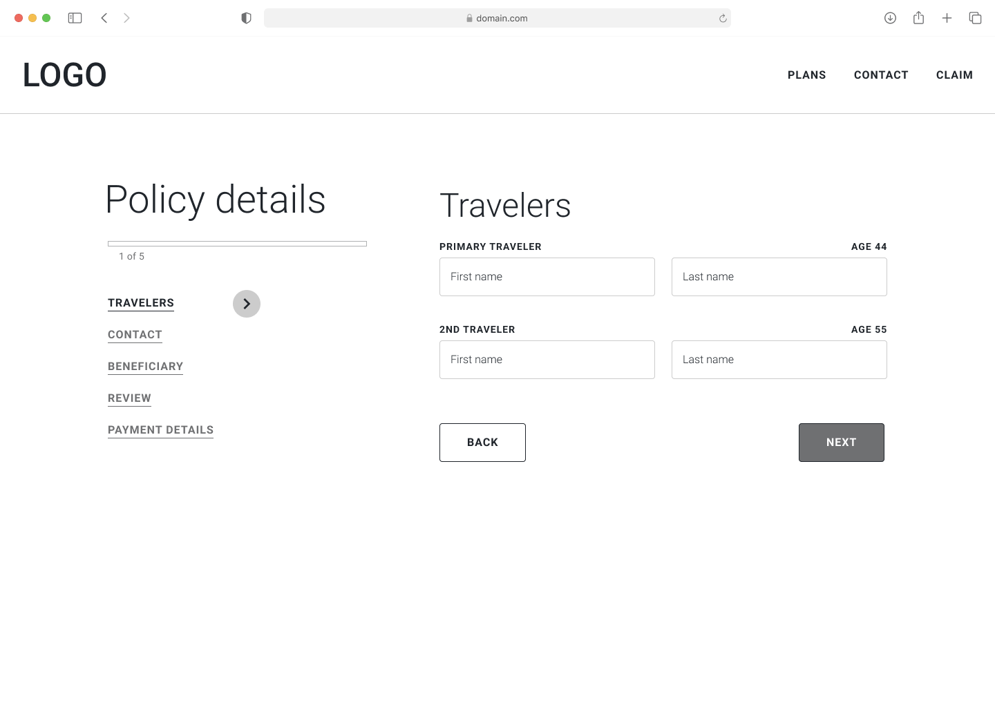
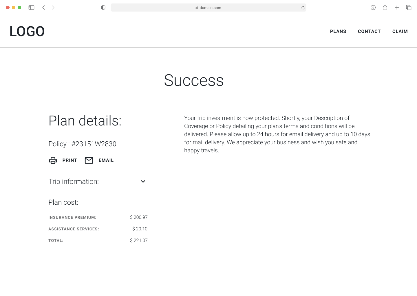
We walked through an full redesign process, beginning with wireframes, through full mockups, and into corresponding development. After reviewing the features with our internal stakeholders, we focused on a more streamlined approach that created a “share quote” funnel for agents to quickly generate quotes for clients to use for purchasing.
Results
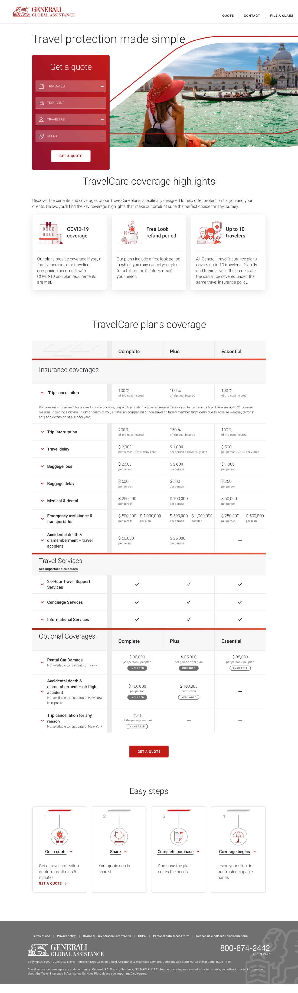
The new site is faster, better looking, aligned with the brand, faster and purpose-built. Removing the legacy site also relieved another team from having to maintain it due to their “tribal knowledge” of the old legacy site. Our clients were happier and more invested in working together.
Before
Wireframes
After
© Angelo Outlaw 2026
Angelo Outlaw
About

Experience
Work
Contact
Travel Cover
Our team’s task for this project was to replace a partner-facing legacy site that had been declining in effectiveness for years, and was becoming a liability. It was never brand-correct to begin with, and had become multi-branded with many of the features no longer working. Naturally, there was a lot of anticipation once the project finally had the support needed to move forward.
My role was to understand the challenge and ensure that the solution was successfully deployed, with oversight of the design, UX/UI, and partner experience as the site was developed.
Visual designs by Enia Amlashi
See it Live
Challenge
I needed to understand which features of the legacy site were actually useful to our partners, and then find ways to build them in a way that would satisfy our internal team as well as the partners themselves.
Solution
We walked through an full redesign process, beginning with wireframes, through full mockups, and into corresponding development. After reviewing the features with our internal stakeholders, we focused on a more streamlined approach that created a “share quote” funnel for agents to quickly generate quotes for clients to use for purchasing.
Results
The new site is faster, better looking, aligned with the brand, faster and purpose-built. Removing the legacy site also relieved another team from having to maintain it due to their “tribal knowledge” of the old legacy site. Our clients were happier and more invested in working together.
Before
Wireframes
After
© Angelo Outlaw 2026
Angelo Outlaw
About
Experience
Work
Contact
Travel Cover
Our team’s task for this project was to replace a partner-facing legacy site that had been declining in effectiveness for years, and was becoming a liability. It was never brand-correct to begin with, and had become multi-branded with many of the features no longer working. Naturally, there was a lot of anticipation once the project finally had the support needed to move forward.
My role was to understand the challenge and ensure that the solution was successfully deployed, with oversight of the design, UX/UI, and partner experience as the site was developed.
Visual designs by Enia Amlashi
See it Live

Challenge
I needed to understand which features of the legacy site were actually useful to our partners, and then find ways to build them in a way that would satisfy our internal team as well as the partners themselves.
Solution
We walked through an full redesign process, beginning with wireframes, through full mockups, and into corresponding development. After reviewing the features with our internal stakeholders, we focused on a more streamlined approach that created a “share quote” funnel for agents to quickly generate quotes for clients to use for purchasing.
Results
The new site is faster, better looking, aligned with the brand, faster and purpose-built. Our clients were happier and more invested in working together. Removing the legacy site also relieved another team from having to maintain it due to their “tribal knowledge” of the old legacy site.
Before
Wireframes
After
© Angelo Outlaw 2026